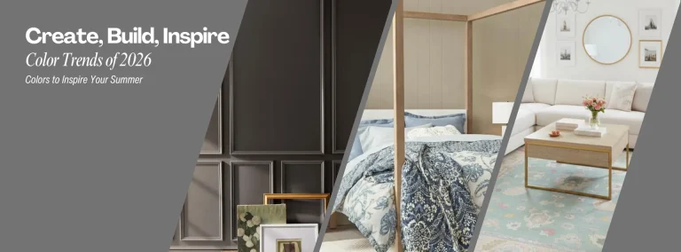
Summer is right around the corner. The bright sunny days are perfect not just for an outing at the beach, but also to get a bit of work done! And what a great time for it to give your home a nice touch of new paint.
Here are some of the trending colors for paints this 2026!
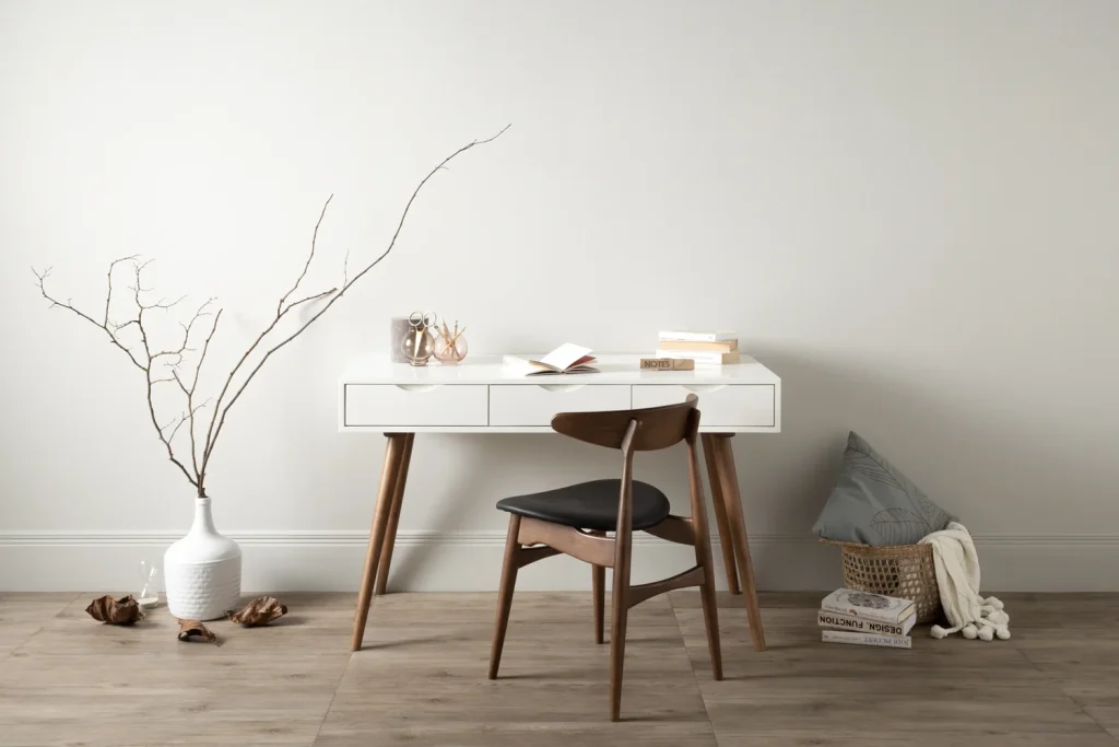
Let’s get the elephant out of the room first. Pantone’s Cloud Dancer. Described as an airy, serene, and lofty shade of white, representing serenity and peace. Some might dismiss it as a “boring” color, with it being a neutral color. But that might also be one of its strengths. Being a neutral color, it isn’t overpowering. One can use the simple color for minimalist set ups, using whites for a room that wants you to breathe. A place where you want some peace and calm. But also, it doesn’t draw too much attention to itself, and highlights other colors and decor in the room. Also, it is a color that can help tone down other more bold colors, creating visual breathing room for the eyes.
Then let’s go to what other color experts are saying:
According to another prominent paint maker, Benjamin Moore, their take on the color of the year is Silhouette. A rich and deep grey, based off espresso tones with deep violet undertones, it represents a deep luxurious feel in contrast to Pantone’s Cloud Dancer. A deep and rich colour like this creates depth and space. And can be paired with lighter tones and neutrals to create a visually distinct room. With an air of luxury, you can also pair these with metallic decor.
One example to liven up your living room this summer is the use of bright colors. Not overtly bright that it would make your eyes bleed, but rather more subdued tones of light and lively colors. Think your sky or light blues with slightly faded notes or your pale lemon yellows that remind you of the soft sand, or sea greens or light pines that give the air of the forest without it being too thick.
But at Cebu Home and Builders Centre, we’re here to enable your creativity. With a wide array of paints and finishing products to customize the insides of your home. Giving each room its own distinct personality. We’re here to help you create the home of your dreams.
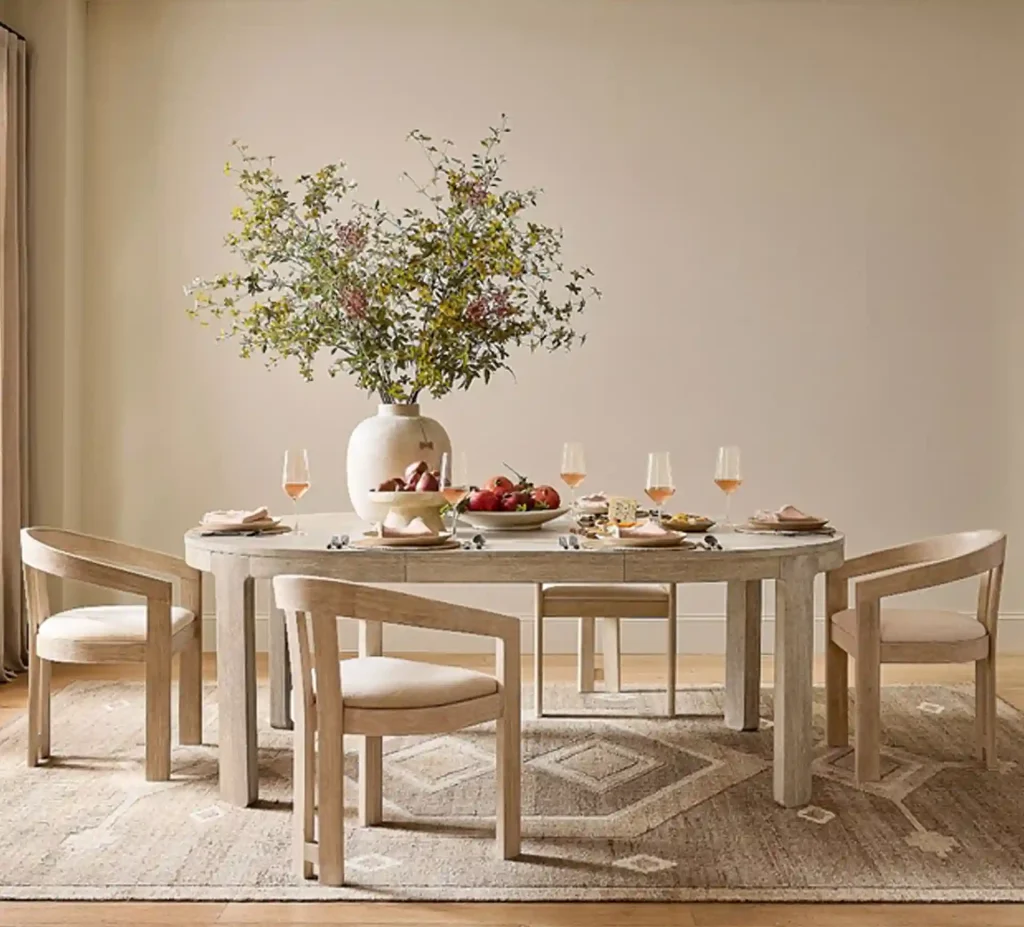
Last but not least, according to Sherwin-Williams, their colour of the year is Universal Khaki. It is a warm and timeless colour, another neutral but somewhat earthy shade that has an air of sophistication and modernity. It’s a clean yet safe colour. You can pair it with a multitude of different colors, especially among the more muted and some warmer tones. Creating a low key yet classy space and letting other elements shine.
But what do all of these colors have in common?
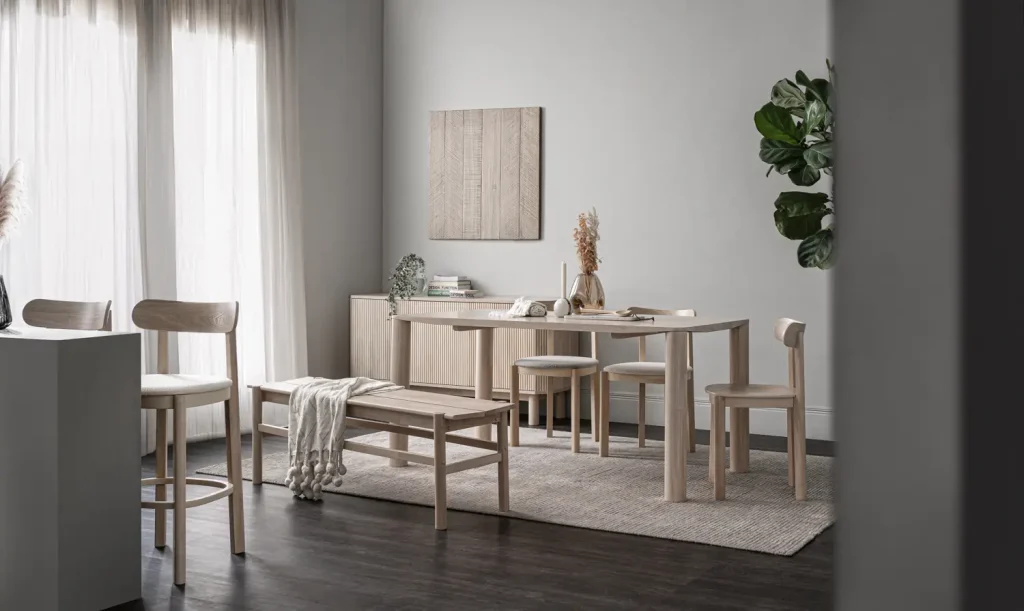
They are neutral and flexible tones. You can pair them with darker and more striking colors and patterns to compliment it. Go bold and go wide, throw in some metallic decor to make them stand out amidst the more plain colors. Or go the other way and make a room with a more calming atmosphere with some softer colors and some wood and natural textures to facilitate it. The possibilities are endless.